Originally published on Grafik.net here.
From its handsome, contemporary gabled premises on the edge of an archetypal Sussex village, the Ditchling Museum of Art + Craft offers a valuable forum for the exploration and celebration of the graphic arts, in keeping with the heritage of the locale in which it sits. Its latest exhibition focuses on the work of Elizabeth Friedlander, a versatile and expressive graphic designer whose career during the mid twentieth century encompassed a diverse range of work, from hand-lettering and typography to pattern design, and whose professional trajectory during the war years is testament to both her determination and her talent.

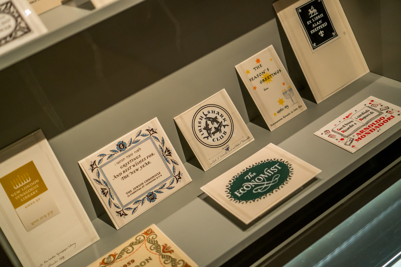
Though Friedlander’s name is not as well known as it should be, her work will be familiar to those with an interest in design history and publishing – she designed book covers for publishers including Thames and Hudson, Pelican, Penguin, Mills & Boon and Methuen, created a collection of decorative borders for Linotype, and was responsible for the graceful filigree of the Penguin 25th anniversary logoform. The exhibition at Ditchling, which takes over the rear half of the Museum of Art + Craft’s main gallery and spills out into the main collection displays, demonstrates the breadth of Friedlander’s practice and her versatility and skill as a designer. Drawn from collections of her work held at University College Cork and by the exhibition’s curator, Katherine Meynell, it encompasses book covers, record labels, packaging for ladies’ stockings and cosmetics, illustrated maps, book tokens, shoe insoles, ale labels and corporate stationery, among many other artefacts.

This neatly-curated selection is interspersed with professional and personal correspondence with clients, associates and friends including Stanley Morison, Sir Francis Meynell, Walter Toscanini and Beatrice Warde. A handwritten letter from Warde to Friedlander on New Year’s Eve 1956 presents a particularly evocative insight into the friendship the two shared – “I’ve just this moment pressed a stamp on the envelope which you just this moment opened, didn’t you? I mean, we think of each other with affection, and it’s ‘now’, whenever it is in time…”. It’s through such exhibits that the show conveys a sense of Friedlander’s everyday life and character which are, as Meynell acknowledges, otherwise elusive within existing documentation of her work; Elizabeth, a short film by Meynell showing in the Museum’s Reading Room, offers further insight on that score.
The dual shadows of fascism and anti-semitism hung heavily over the first half of Friedlander’s life and career, making her achievements during the pre- and post-war years both impressive and poignant. She made an auspicious start in Germany during the 1920s and 30s, working for the modern women’s illustrated magazine Die Dame, and was commissioned by the Frankfurt-based Bauer Foundry in 1927 to create her eponymous Elizabeth typeface, which went on to be a significant commercial and critical success (its name having been changed from Friedlander Antiqua to downplay the Jewish origins of its designer). The introduction of the anti-semitic Nuremberg Laws in Germany in 1935 made it impossible for Friedlander to work, and she left Germany for Italy in 1936 with little more than two portfolios and her mother’s 1703 Klotz violin, which is displayed within the exhibition.
Driven to leave Italy following the introduction of Mussolini’s race laws, she explored the possibility of work in the USA, before eventually entering the UK on a domestic servant’s visa with the assistance of the Society of Friends. The rear of the exhibition space is devoted to a selection of correspondence and personal documents from this time, demonstrating the precarity of Friedlander’s situation, her resourcefulness in overcoming adversity, and the heartening efforts of her friends and fellow designers to assist her.

Following her arrival in London, Friedlander approached the poet and publisher Francis Meynell, who assisted her in securing freelance work for a range of clients including his current employer Mather & Crowther and The Post Office, as well as introducing her to Ellic Howe, for whom Friedlander went on to work in a newly-formed British black propaganda unit, forging Nazi rubber stamps and ration books. It’s through this connection to Meynell that the relevance of Ditchling as a venue becomes apparent – Francis was the son of Wilfrid and Alice Meynell, local friends and associates of Eric Gill who became involved with the flourishing creative community at Ditchling, and grandfather of Katherine Meynell herself, who first encountered Friedlander’s work within some of his papers.

Perhaps the exhibition’s greatest success is the degree to which it balances the telling of Friedlander’s remarkable story with a celebration of her accomplishment and skill as a designer. Even in the absence of contextual information, her work stands as an example of the finest midcentury graphic design; crisp yet expressive, demonstrating a keen eye for detail and a precise way with line and letterform, it is a pleasure to explore.
Images © Ditchling Museum of Art + Craft, photography by Sam Moore.